
An effective billboard design follows the six-second rule, uses high-contrast colors, limits messaging to seven words or fewer, and includes clear contact information. Your billboard has six seconds to work or waste your money. Studies show successful billboards generate an average $6 return for every $1 spent, with potential ROI reaching 497% when design principles are properly applied. Most businesses approach billboard design like magazine ads, cramming in multiple messages and using tiny fonts, killing returns before they start.
The reality hits harder than expected.
The average person spends just three to five seconds looking at a billboard. If your message doesn’t process in that time, it won’t stick.
Poor design kills those returns before they start
The Six Second Rule Changes Everything
Six seconds sounds like nothing until you’re designing for it.
In those seconds, a driver traveling 60 mph covers 528 feet. They’re managing traffic, checking mirrors, thinking about their destination. Your billboard competes with all of that.
Professional designers understand this constraint shapes every decision.
Font size becomes critical. Color contrast determines visibility. Message hierarchy decides what gets processed first. Layout affects comprehension speed.
These aren’t creative preferences. They’re technical requirements.
Visual Hierarchy Determines Success
Your billboard needs a clear reading path that works at highway speeds.
Start with one primary message. Make it the largest, boldest element on the board. Everything else supports this central idea.
Secondary information gets smaller treatment. Tertiary details might not belong on a billboard at all.
The eye should move logically through your design. Primary message first, supporting elements second, contact information last. Any confusion in this flow costs you conversions.
Professional designers create this hierarchy through size, contrast, and positioning. They know which elements grab attention and which ones guide action.
Typography Rules You Can’t Break
Billboard typography follows different rules than print or digital design.
Serif fonts become unreadable at distance. Script fonts disappear entirely. Condensed typefaces lose clarity. Bold, sans-serif fonts dominate effective billboard design for good reason.
Letter spacing matters more than you think. Characters need room to breathe at highway viewing distances. What looks perfect on your computer screen becomes a blur from 500 feet away.
Font size calculations get technical quickly. A general rule suggests one inch of letter height for every 10 feet of viewing distance. But this varies with font choice, color contrast, and viewing angle.
Professional designers have tested these variables across thousands of installations.
Color Psychology Meets Technical Requirements
Color choices affect both psychology and visibility.
High contrast combinations ensure readability. Yellow on black, white on blue, black on yellow – these pairings maximize legibility at distance and speed.
But contrast alone doesn’t guarantee success.
Color psychology influences response rates. Red creates urgency. Blue builds trust. Green suggests growth or environmental consciousness. The right color combination supports your message while ensuring visibility.
Lighting conditions complicate color choices further. Colors that pop in daylight might fade at dusk. Reflective materials affect appearance. Digital billboards offer different color capabilities than printed versions.
These technical considerations require specialized knowledge.
Message Optimization for Maximum Impact
Effective billboard messages follow strict word count limits.
Seven words or fewer typically work best. Each additional word reduces comprehension probability. Long sentences become impossible to process at highway speeds.
Strong verbs drive action. Clear nouns avoid confusion. Unnecessary adjectives waste precious space and attention.
Your value proposition needs immediate clarity. What problem do you solve? Why should someone call you? How do they reach you?
Professional copywriters understand how to compress complex value propositions into billboard-appropriate messages without losing impact.
Technical Specifications Matter More Than You Think
Billboard Production Specifications and Requirements
Professional billboard production involves complex technical requirements that directly impact design effectiveness and campaign success.
Standard Billboard Dimensions and Design Implications
Bulletin (14′ x 48′): Highway locations requiring maximum visibility and simplest messaging for 65+ mph viewing speeds
Junior Billboard (6′ x 12′): Urban environments with pedestrian viewing, allowing more detailed information elements
Poster (12′ x 24′): Suburban locations with moderate traffic speeds, requiring balanced design approach
Each size demands different strategic approaches. Bulletins need maximum simplicity for high-speed viewing. Junior billboards can include more information elements for slower traffic and pedestrian audiences. Our design team creates size-specific layouts optimized for viewing conditions.
Digital vs. Printed Production Specifications
Digital billboards require RGB color space at 72-150 DPI resolution depending on pixel pitch and viewing distance. Animation capabilities allow rotating messages but require careful timing consideration for message processing. File sizes must optimize for quick loading while maintaining visual quality across different weather conditions.
Printed billboards need CMYK color profiles at 30-75 DPI resolution. Higher resolutions waste file space without improving appearance at typical viewing distances. Proper color calibration prevents disappointing results when digital designs transfer to large-format printing.
Critical Production and Installation Factors
Bleed areas extend design elements 6-12 inches beyond finished size to account for mounting variations and installation tolerances. Safe zones keep critical elements like logos and phone numbers 24+ inches from edges to prevent trimming issues during installation.
Weather resistance affects material selection and design longevity. UV-resistant inks prevent fading over campaign duration. Lamination protects against moisture and temperature extremes. Wind load calculations influence structural mounting requirements and design element placement.
File Preparation and Quality Control
Vector graphics scale better than raster images for large format printing without quality loss. Text should be converted to outlines to prevent font substitution issues during production. Embedded images need sufficient resolution for final output size calculations.
Color separation requirements vary by printing method and vendor capabilities. Spot colors may be necessary for exact brand matching. Metallic or fluorescent inks require special consideration and cost analysis for enhanced visibility effects.
Our technical team manages these production complexities while ensuring design effectiveness isn’t compromised by manufacturing limitations. We coordinate directly with production vendors to optimize files for specific printing methods and installation requirements, preventing costly reprints and delays
Location Specific Design Adaptations
Location-Specific Design Strategy and Optimization
Billboard placement location determines viewing conditions and requires customized design approaches for maximum effectiveness and ROI.
Highway Billboard Optimization Requirements:
High-speed highway locations demand maximum design simplicity. Drivers traveling 65+ mph have minimal processing time and divided attention between traffic management and billboard viewing. Design must prioritize single, bold messages with maximum contrast ratios. Complex graphics, multiple information points, or decorative elements become impossible to process effectively.
Color choices need enhanced consideration for highway speeds and viewing angles. High-contrast combinations work best – yellow on black provides 94% readability, white on dark blue achieves 89% effectiveness, black on yellow reaches 87% visibility rates. Reflective materials can enhance nighttime visibility but may create glare issues during peak sunlight hours.
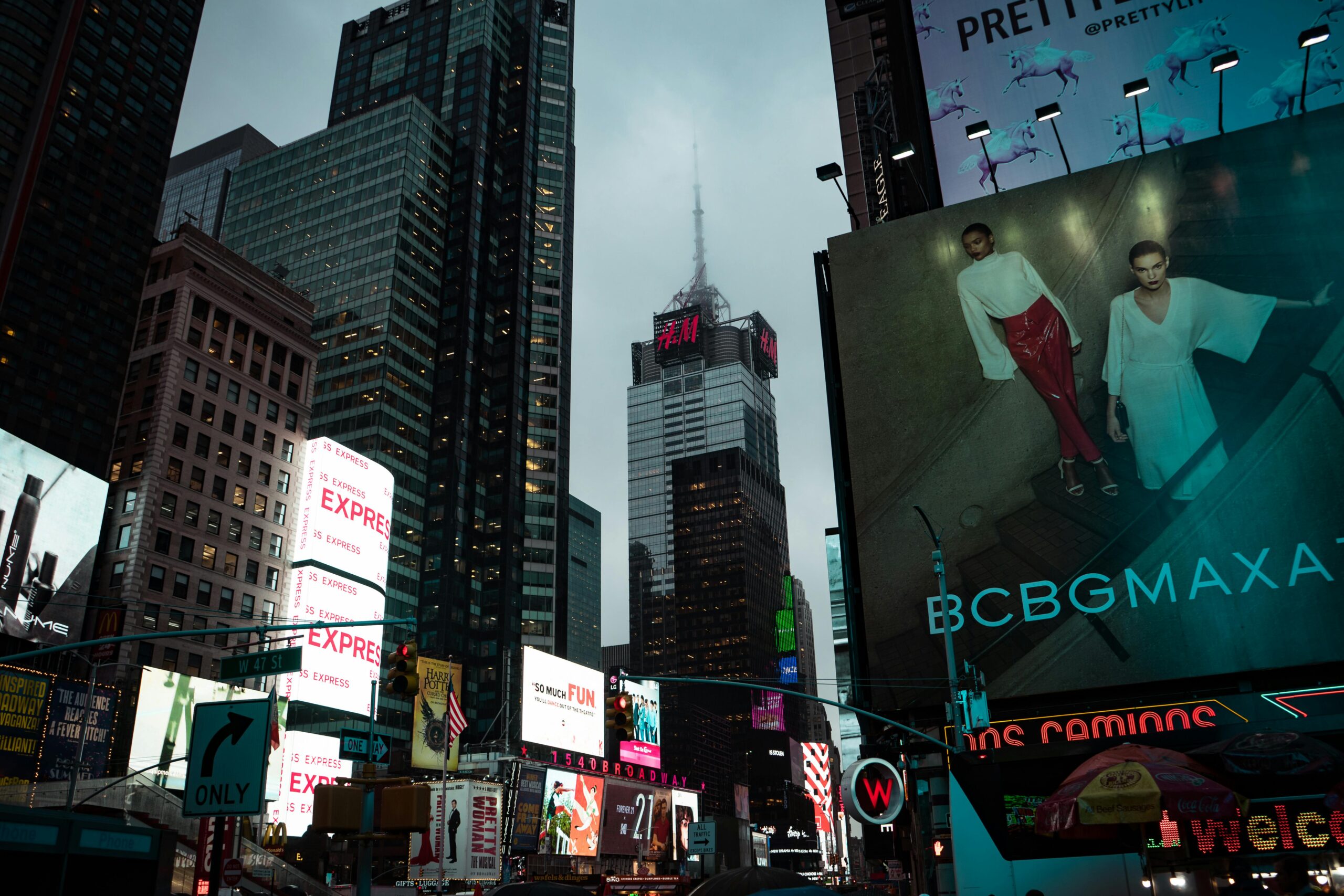
Urban Environment Design Adaptations:
City billboards serve pedestrian and slow-traffic audiences, allowing increased design complexity and information density. Stop-and-go traffic provides longer viewing opportunities, making multiple message elements feasible when viewing time extends beyond the standard six-second processing window.
Urban locations often face intense visual clutter competition from surrounding signage, building colors, and environmental factors. Higher contrast levels become necessary to cut through visual noise. Strategic positioning of key elements accounts for typical urban viewing patterns and pedestrian sight lines.
Environmental and Lighting Considerations:
Natural lighting changes throughout the day significantly affect color appearance and message readability. Colors that perform well in bright daylight conditions may fade or become illegible during dawn, dusk, or overcast weather conditions. Professional designers test color combinations under various lighting scenarios to ensure consistent performance.
Artificial lighting from street lamps, building illumination, or vehicle headlights can either enhance or interfere with billboard visibility depending on design choices. Strategic color and contrast selection accounts for these environmental lighting factors throughout campaign duration.
Traffic Pattern and Audience Analysis:
Morning and evening commute directions often favor different messaging strategies and value propositions. Commuters heading to work might respond to productivity or convenience messages, while those returning home may be more receptive to family or entertainment-focused content. Rush hour versus off-peak traffic creates different viewing condition requirements.
Seasonal changes significantly affect visibility and audience behavior patterns. Summer vegetation growth can obstruct sight lines and require design adjustments. Winter weather conditions influence color and contrast effectiveness, particularly for printed materials exposed to harsh conditions.
Our location analysis process includes comprehensive traffic pattern research, seasonal visibility assessment, and environmental factor evaluation before design development begins. This ensures optimal design performance across all viewing conditions and audience segments
Common Mistakes That Kill ROI
Poor design can reduce billboard ad recall of 70% or more by half when design fails.
The most expensive mistake involves cramming too much information. A real estate company copied their full-page magazine ad, including 150 words, onto a billboard. Drivers couldn’t read it. Call volume didn’t budge.
Another costly error involves missing essential contact information. An HVAC company ran a clever billboard with a great pun and thermostat photo. But they forgot to include their business name, phone number, or logo. It got laughs but zero conversions.
Typography failures happen frequently. Small fonts, poor color contrast, and decorative typefaces make messages unreadable at distance.
These mistakes waste advertising budgets and opportunity costs.
These design failures represent missed opportunities that professional oversight prevents entirely. Our design review process includes systematic evaluation of readability, message clarity, and technical compliance before production. We catch these issues during development rather than after expensive media placement, protecting both advertising investment and campaign effectiveness.
Professional Design ROI Justification
Professional billboard design pays for itself through improved response rates.
Effective designs increase brand recall, drive more calls, and generate higher conversion rates. The difference between amateur and professional design often determines campaign success.
Professional designers bring specialized knowledge about technical requirements, location optimization, and message effectiveness. They understand production processes, material limitations, and regulatory compliance.
This expertise prevents costly mistakes and maximizes advertising investment returns.
The design investment becomes negligible compared to media costs and lost opportunity from ineffective messaging.
Measuring Billboard Design Effectiveness
Successful billboard campaigns track specific metrics beyond impressions.
Call tracking numbers measure direct response. Website traffic spikes indicate digital engagement. Brand awareness surveys capture recall improvements. Sales attribution connects billboard exposure to revenue.
Professional designers help establish measurement frameworks that demonstrate ROI and guide optimization decisions.
These metrics justify advertising spend and inform future campaign improvements.
Strategic Integration with Marketing Channels
Billboards work best as part of integrated marketing strategies.
Consistent messaging across channels reinforces brand recognition. Billboard awareness can boost performance of digital ads, social media, and search campaigns.
Professional designers ensure billboard creative aligns with broader marketing materials while optimizing for outdoor advertising requirements.
This strategic approach maximizes cross-channel synergies and overall marketing effectiveness.
Frequently Asked Questions About Professional Billboard Design
What size should text be on a billboard for maximum readability?
Text size depends on viewing distance and speed. For highway billboards, use the 1:10 ratio – one inch of letter height for every 10 feet of viewing distance. At 300 feet (typical highway viewing), letters should be at least 30 inches tall for the main message. However, this varies by font choice and color contrast. Bold, sans-serif fonts can work slightly smaller, while thin or decorative fonts need larger sizing. Our design team uses proprietary calculations that account for font weight, color contrast, and viewing angle to optimize readability for each specific location.
How do I choose the right colors for my billboard design?
High contrast combinations ensure maximum visibility. Yellow text on black backgrounds, white on dark blue, or black on yellow provide optimal readability. Consider lighting conditions – colors that work in daylight may fade at dusk. Digital billboards offer different color capabilities than printed versions. We test color combinations under various viewing conditions and provide color-corrected proofs that show exactly how your design will appear at different times of day and weather conditions.
What are the most common billboard design mistakes to avoid?
The biggest mistake is cramming too much information. Stick to 7 words or fewer for maximum impact. Avoid serif fonts, script typography, or decorative elements that become unreadable at distance. Poor color contrast kills visibility. Missing contact information wastes the entire investment. These mistakes can reduce ad recall by 70% or more. Our design review process prevents these costly errors through systematic evaluation of every design element.
How much should I budget for professional billboard design?
Professional billboard design typically costs $500-$2,500 depending on complexity and revisions needed. This investment becomes negligible compared to media costs ($1,500-$30,000+ monthly) and the opportunity cost of ineffective design. Professional design can double or triple response rates, making the design fee pay for itself within the first month. We provide detailed ROI projections showing expected return from improved design effectiveness.
What file format and resolution do I need for billboard printing?
Digital billboards require RGB color space at 72-150 DPI depending on viewing distance. Printed billboards need CMYK at 30-75 DPI with appropriate bleed areas. File formats vary by vendor – typically PDF, EPS, or high-resolution TIFF. Dimensions must account for safe zones and production tolerances. We handle all technical file preparation and coordinate directly with production vendors to ensure perfect results.
How long does professional billboard design take from start to finish?
Professional design typically takes 5-10 business days from brief to final files. This includes concept development, revisions, technical file preparation, and production coordination. Rush projects are possible but may limit design options. Our streamlined process includes stakeholder review periods and copy refinements to ensure maximum campaign effectiveness.
Your billboard design determines whether your advertising investment pays off or gets ignored. Six seconds decides everything.
Professional design expertise transforms that brief window into measurable business results. The technical knowledge, creative experience, and strategic thinking required for effective billboard design justify professional investment.
Your next billboard campaign deserves designs that actually convert viewers into customers.